All bets are on the color blue for 2020—well, almost all. With Pantone’s revelation late last week that it has chosen Pantone 19-4052 Classic Blue as its Color of the Year for 2020, three of the four hues selected by color forecasters over the past several months to play a starring role next year are shades of blue (Sherwin -Williams chose Naval and PPG chose Chinese Porcelain, while Benjamin Moore opted for First Light, a pale pink). Pantone’s selection noted that Classic Blue is a “timeless and enduring hue elegant in its simplicity” and represents stability in a time of uncertainty.
“We are living in a time that requires trust and faith. It is this kind of constancy and confidence that is expressed by PANTONE 19-4052 Classic Blue, a solid and dependable blue hue we can always rely on,” noted Leatrice Eiseman, executive director of the Pantone Color Institute. “Imbued with a deep resonance, PANTONE 19-4052 Classic Blue provides an anchoring foundation.”

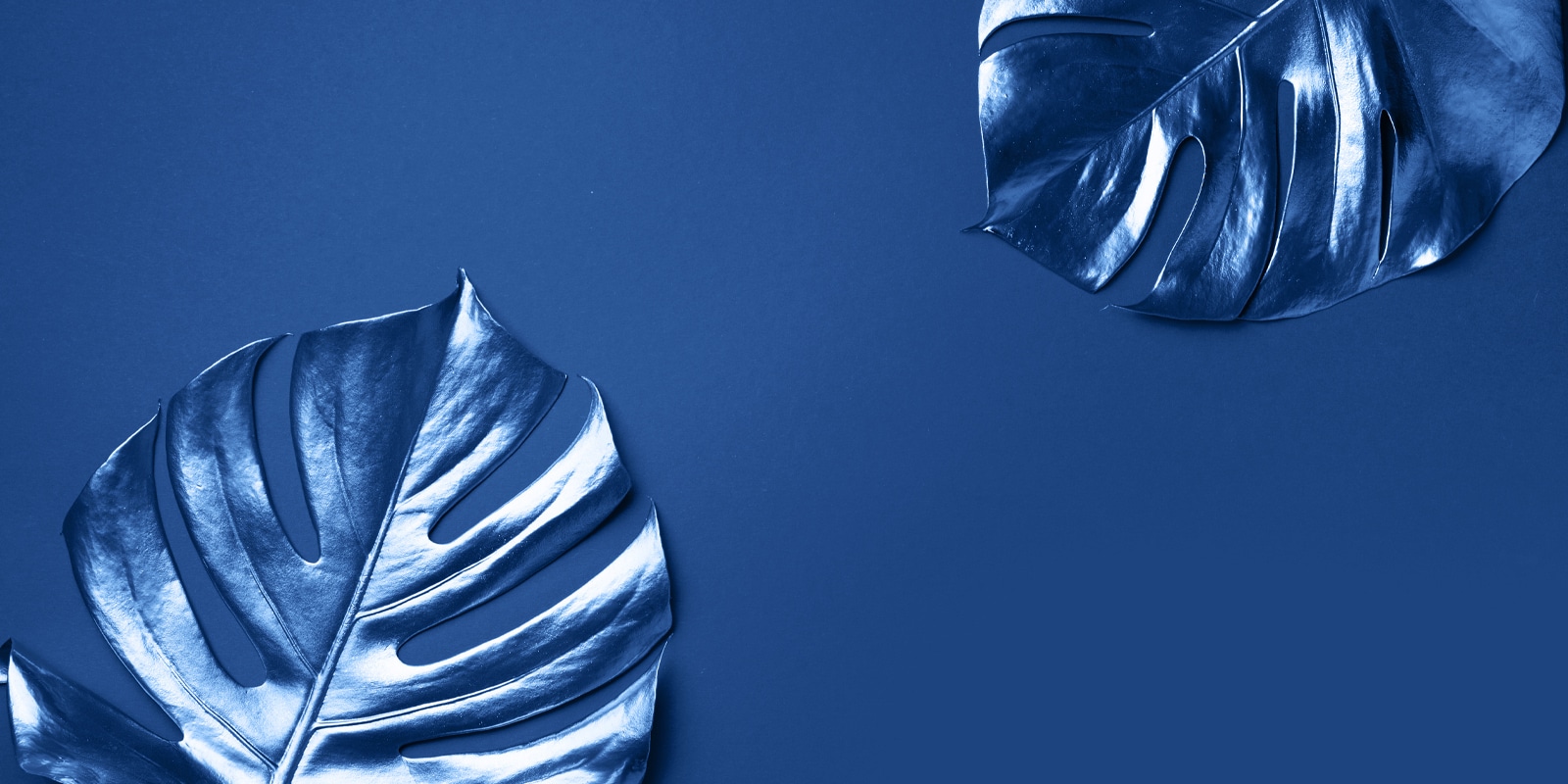
Pantone 19-4052 is described as classic, stable, and restful. Photography courtesy of Pantone.
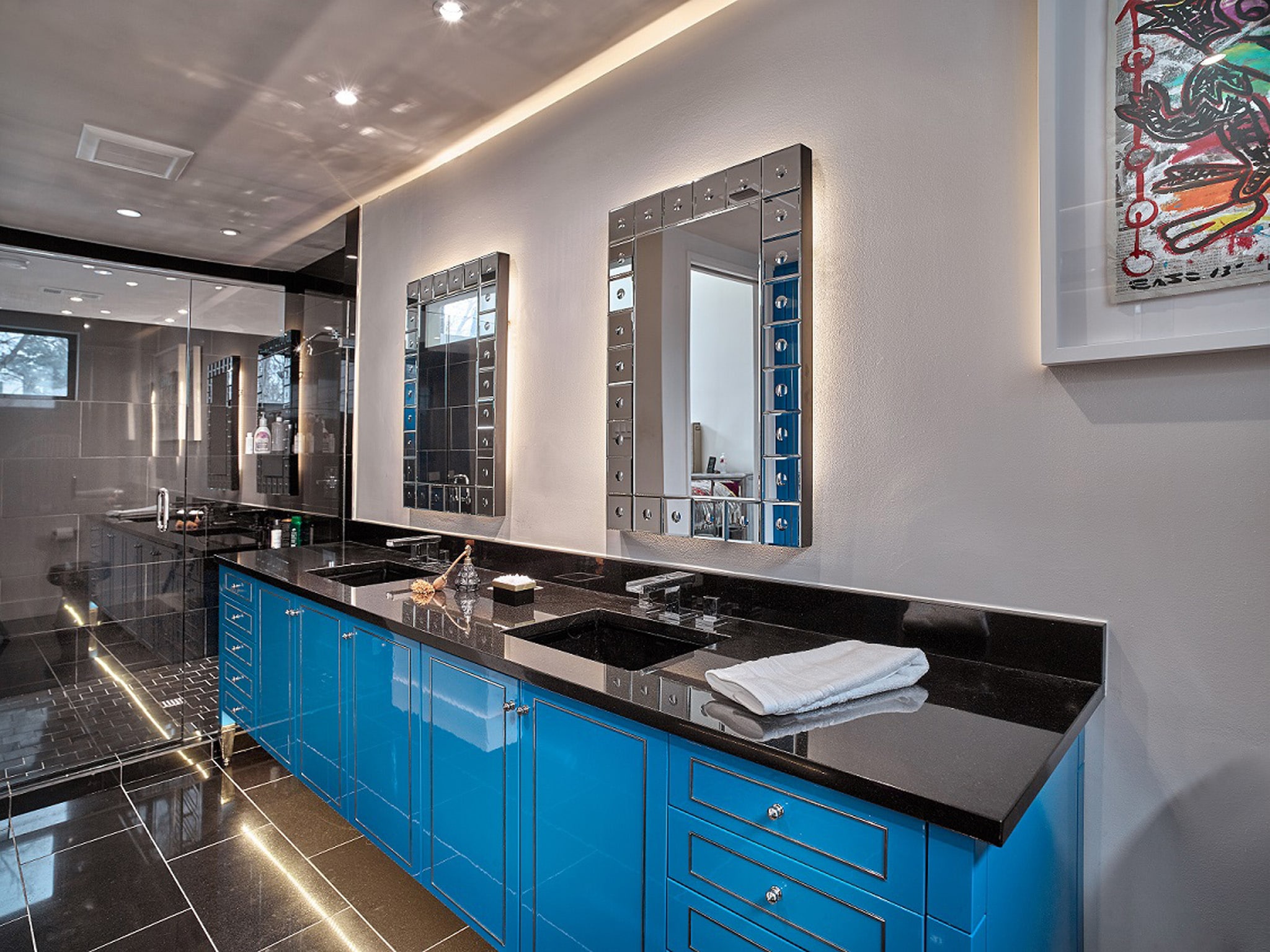
A boundless blue evocative of the vast and infinite evening sky, PANTONE 19-4052 Classic Blue is a restful color that brings a sense of peace and tranquility to the human spirit. In applications related to home decor, Pantone notes that Classic Blue is a pervasive favorite, offering the promise of protection, a stable foundation, and creative confidence. The hue is easily applied across different materials, textures, and finishes, Pantone noted, and can express tradition and elegance as well as boldness.

